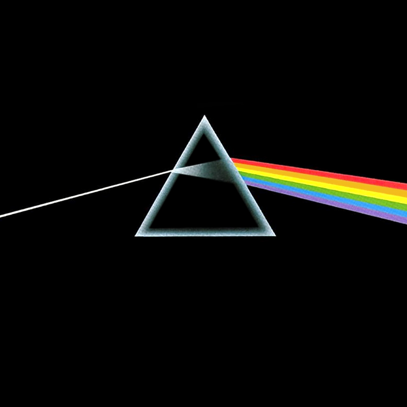
This has been named the greatest album cover of all time, due to it's simple, yet bold design. The artwork depicts a ray of light entering a prism and refracting out as the colours of the rainbow. It is one of the most instantly recognisable album covers of all time and is said to represent the bands' striking stage lighting and the album lyrics which are all about life, death and madness. An interesting aspect is that the album name, and even the band's name are not printed on the cover. This suggests that they wanted the artwork to speak for itself and proves that one simple image is powerful enough when it comes to album covers.
The artwork adds a sense of mystery as there is no image of the band members. In fact, they don't feature on many of their album covers, evidence that promotion of their image is not their principal motive. Their aim is to create a connection between themselves and the audience through the use of an extremely simple idea and design. This is something we will take in to consideration when creating our own CD cover, as it is clear that an uncomplicated concept is much more powerful.
The artwork adds a sense of mystery as there is no image of the band members. In fact, they don't feature on many of their album covers, evidence that promotion of their image is not their principal motive. Their aim is to create a connection between themselves and the audience through the use of an extremely simple idea and design. This is something we will take in to consideration when creating our own CD cover, as it is clear that an uncomplicated concept is much more powerful.
No comments:
Post a Comment