We have been in the process of filming for a few weeks now and have already got quite a lot of footage. We now have all we need for the establishing shots in the intro and lots of other relevant shots for example people dancing, some of which we did spontaneously. Here are a just a few of our stills from our work!
Kitchen scene- middle aged man in suit, table, toast, bright coloured socks, radio (Camera and Tripod) Shower scene- young man, camera and tripod, steam. Party scene- 20+ young people, step ladder, camera and tripod, amp & ipod Library scene- camera, tripod, teenager Street scene- bury, norwich, london (?) Car scene- a driver, camera, car radio
Other ideas for locations Glass lift (Norwich) Thetford Hill Wedding (real life) Marks & Spencer's café Escalator
Aside from our definite shots (at the top), we remain open minded to what we might encounter that could be useful in the process of filming. Because our film is going to be mainly concept based, it is not a problem to be spontaneous or random and therefore we want to keep it exciting.
Storyboard Artist: Holly Camera Operator: All Director: All Editor: All Sound Design: All Set Designer: All Props: All Costume: All Lighting: All Make Up: All Special Effects: Katie (cos she's special)
We are going to all contribute to each of these aspects of the music video production because we all feel that we have qualities in each area. We also want to exercise and expand our knowledge of each production and editing stage, as they are all imperative for the development of our media skills.
The image above is from the album 'Mad Season' by Matchbox Twenty. I chose this particular CD cover as it contrasts highly to my other choice of 'The Slim Shady LP'. Having said this, they both hint at a slightly crazy and twisted nature and this is even evident by the album title. The simple image is very childlike and only takes up around 1/3 of the space used. The rest is to highlight the text as the artist is again not included in the picture. The fact that they have used a character resembling an elderly man wearing bunny ears and 'walking' a toy peacock suggests that the album will be full of insanity! The character's eyes are downcast and he seems unaware of the picture being taken, which could tell the audience that the artist prefers substance over style, juxtaposing Strinati's theory. This has enabled me to realise that concept-based covers can be just as appealing as narrative or visual images. This is something to take into consideration for my own project as the audience gains a sense of mystery and therefore becomes intrigued.
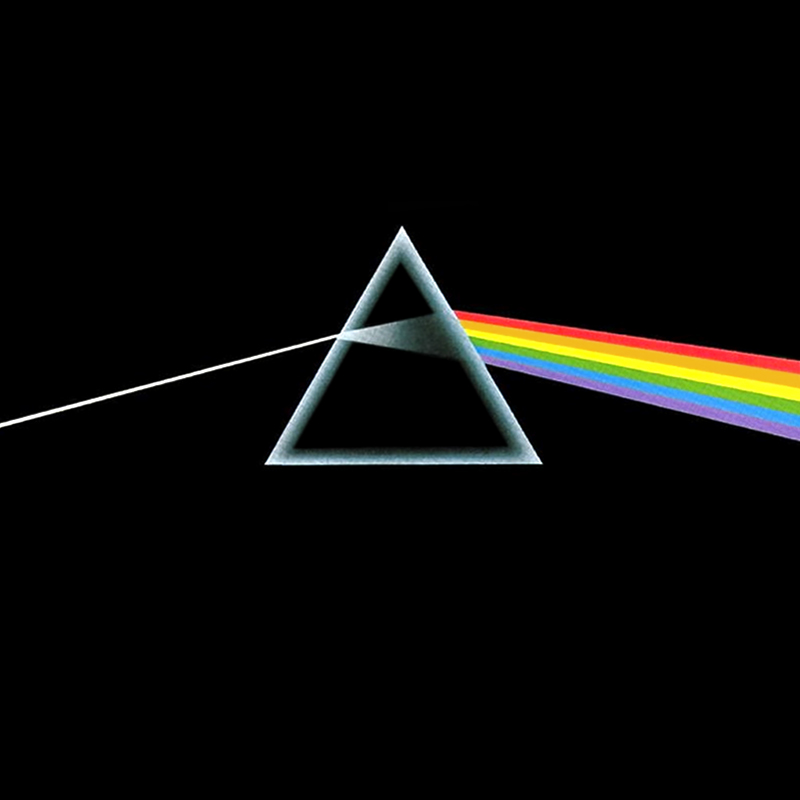
This is the cover for Pink Floyd's 'Dark Side of the Moon' album, released in 1973:
This has been named the greatest album cover of all time, due to it's simple, yet bold design. The artwork depicts a ray of light entering a prism and refracting out as the colours of the rainbow. It is one of the most instantly recognisable album covers of all time and is said to represent the bands' striking stage lighting and the album lyrics which are all about life, death and madness. An interesting aspect is that the album name, and even the band's name are not printed on the cover. This suggests that they wanted the artwork to speak for itself and proves that one simple image is powerful enough when it comes to album covers. The artwork adds a sense of mystery as there is no image of the band members. In fact, they don't feature on many of their album covers, evidence that promotion of their image is not their principal motive. Their aim is to create a connection between themselves and the audience through the use of an extremely simple idea and design. This is something we will take in to consideration when creating our own CD cover, as it is clear that an uncomplicated concept is much more powerful.
The reason I picked this CD cover to analyse is because it is a classic one that most people should see and also, it is different to the Jessie J one.
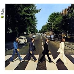
This is concept based, it also contains aspects of performance in that all 4 Beatles are included in the shot and it could be argued that there is narrative in there as well because they are crossing the road and therefore possibly on a metaphorical journey.
There positioning in the frame says a lot about their equality within the group, whereby from this image, no one member is more important than another. Although the one at the front leads the way? The location suggests that the band are in touch with reality and the public with it being a very standard street. Additionally, with them walking one behind the other, it adds the sense that they are detached from one another in terms of their abilities- maybe each individual is unique and therefore cannot be compared with another bandmate. Lastly, the white border with the simple logo of "The Beates" is very small in comparison to the image. This infers that the audience will already know who the Beatles are and therefore they do not need an introduction or a large font across the middle stating the band name. This says a lot about the who persona and importance of the band.
From this, I think we can take the message that sometimes a simple concept cannot work really well as opposed to complex ideas.
This is the album cover for 'The Slim Shady LP' by rap artist Eminem.
I think the image is very thought-provoking and gives the audience a clear insight as to what the album includes. The music itself is very dark and this is presented through the use of the dead body in the boot of the car, and the young child's exposure to this. This is perhaps a warning in itself to the public that the material included will have a sinister nature, much like Eminem's evil alter-ego 'Slim Shady' linking in with the title of the album. The tinted greyish colour of the album enables the colourful typography of 'Slim Shady' to really stand out and we can see the childish font used. This could also show that some of the lyrics used are more metaphorical of a childlike imagination rather than the literal sense of the meaning. The image itself is extremely gothic, with the sky playing a dominant part of the picture. The moon is clearly enlarged to cast a dark light on the troubled scene. This is a main selling point because although the artist is not visable on the cover, it tells a part of the story that would encapsulate the audience's interest. This has helped me to think about how we could project a clue as to what the listener's can expect when hearing our song and watching our video.
The child depicted on the cover has had her eyes retouched in terms of proportion and is a representation of the album title 'Beautiful Freak'. The innocence of the child is still evident despite the distortion of her eyes, suggesting that even with an element of 'freak' or abnormality in people, beauty always outshines this. The wider message is that looking or acting slightly different doesn't deserve critisicm from society and that beauty is in the eye of the beholder. The bright white background, and the image of the girl which has had all colour drained from it connotes innocence and purity. Her innocence is also shown through her body language (crawling position) which emphasises her infancy and vulnerability. The flower in the image is also a portrayal of the 'Beautiful Freak' title. Although it is dead, the associations of beauty we have with this plant are still distinct. This also supports the overall message of the cover that imperfections are trivial and irrelevant. I think this album cover is extremely effective overall, as it has a clear underlying meaning. I think it is important for a cover to actually present an idea or view, rather than be an unintelligent design with no real significance or message.
Our music video will be mainly targeted at people aged 12 years plus. Having said this, there will be a distinctive focus on young adults that will understand the intertextual references and mature humour of the video. The upbeat tune contrasts with the slow singing style which appeals to a broad range of listeners. As the song has featured in various children's films, this could catch the eye of a younger viewer and encourage them to watch the video due to their previous recognition of the song. Overall, we are producing a music video susceptible to all ages within reason.
To aid the planning process for our music video, we asked a variety of people from different age groups and genders a range of questions relevant to our work. These are our results....
Males: 50% Females: 50% Q1. What is your preferred genre of music video? Pop- 30% RnB- 25% Rock - 15% Indie - 20% Metal- 10%
With this question, we wanted to establish first of all what kinds of video people like to watch as often music videos differ greatly within the genre they are associated with. Q2. How often do you watch music videos? Everyday- 20% A few times a week- 30% Occasionally- 45% Never - 5%
The purpose of this question is purely to establish how interested the general public are in watching music videos, which will help us to comprehend who we are aiming at. Q3. Why do you watch music videos? "Entertainment and research for my work" "For escapism" "To listen to the music" "To pass the time" "Out of curiosity"
Evidently the reasons people watch music videos differs a lot but from asking this question, we can see that music videos are their mainly to support and promote the song the artist has created. Therefore, we need to make our music video something that people want to watch, not just want to hear. Q4. Who is your favourite artist or band? "Katy Perry" "Adele" "Chris Brown" "Example" "Kasabian" "The Temper Trap"
These artists are all very mainstream and popular unlike the alternative song which we have chosen to create our coursework with. However, this should not be too much of a problem because with a song so timeless as the one we have chosen, there is a lesser risk of people getting bored of it because they have heard it so often. Q5. If a music song came on featuring a song you wouldn't normally listen to, would this affect your opinion of it? Yes- 40% No- 60%
This is quite a reassuring response because being quite an old song, we wouldn't expect people to listen to it out of choice however now we know that they aren't necessarily going to be put off by it just because of this. Q6. What do you most enjoy about watching a music video? Narrative- 55% Performance- 30% Concept- 20%
It is interesting to see that the majority of people are more interested in a storyline within a music video rather than a performance because with our current ideas, a performance is not what we have in mind whereas we are much more swayed towards a narrative within our music video. Q7. What do you prefer to see out of these options when watching a music video? Scantily clad women and men - 5% Dancing - 40% People having a good time - 55% People who are sad - 0%
From our brainstorming, we are most likely to use people who appear to be enjoying themselves within our project and therefore it is good to see that this had the majority vote. It is also nice to see that not many people wanted to see half naked people running around which is also reassuring because we weren't contemplating this but it is a popular technique nowadays. Q8. How far into a music video does it normally take you before you get bored? Less than 1 minute- 20% 1-2 minutes- 25% 2-3 minutes- 30% I watch it to the end - 25%
We asked this question because the song we have chosen at its longest version is around 5 minutes and therefore it is important to know if we can hold peoples interest for that long. Although it is the smallest percentage, it is a bit worrying that some people tune out before a minute is up, but hopefully our music video will be good enough to keep people watching! Q9. For this part, we asked people to sing the song from a scene in the film Mathilda by Roald Dahl where the little girl is seen making pancakes... we hoped this would gage how many people recognised the song but unfortunately only a couple of people could. However when we sang them the tune a lot of them did recognise it, which is good because we want them to remember it from Mathlida and this might boost its popularity.
Overall, our questionnaire has been a huge help for us because although our answers wont make us alter our plans, we now have solid research into an audiences response to music videos and this should help us to create something people will enjoy watching, which is the main purpose of a music video.
This is an example of an A2 music video taken from the song 'Bring me to Life' by the band Evanescence.
This is an example of a relatively positive music video. This is because the narrative is compelling and also thoughtful; luring the viewer to watch the entire clip in order to find out the end of the story. I really enjoyed this music video as there is an evident link between lyrics and visuals, because the suicide of the girl ties in with the title of the song about being brought back to life. Although the students have put an interesting literal spin on the song's meaning as opposed to metaphorical references.
The close-up shots are highly effective because we get a glimpse of the pain our protagonist is feeling, helping us to percieve a clear mood to the song. Some shots are rather repetitive, and this makes me feel that they could have used their time more effectively and put more thought into the narrative.
The end shots are particularly effective because they are flashbacks of her life and the shots included throughout. Being short and snappy we get an insight as to how short her life was, and the editing really emphasises this. Overall a really good music video.
This an A Level music video for the song 'Girls & Boys' by Blur:
I don't think there is a strong narrative to this video, and it is largely concept-based. This is evident from the random visuals of people moving their eyes to the beat, people dancing and a man dressed as a woman in a hairdresser's. It is obvious that there is some reference to boys and girls switching roles. One good thing is the use of the visual effects of animals running in the background, as the character is running. Although it doesn't look realistic and has no relationship with the song, I think it was used for more of a comic effect.
The use of the signs saying 'Girls' and 'Boys' shown as the corresponding lyrics are sung creates a link between the lyrics and visuals. The effect is that the girls are dressed up as and acting like boys and vice versa. There are then quick shots of question marks appearing above a girl's head, which is quite well done as the camera remains steady.
Overall I think the the camerawork is good, and some of the visual effects are suited to the genre. However, I think the visuals are often quite random and mismatched.
This is an example of an A2 Music Video produced by someone from another school.
I think that the video is very effective for many reasons. Firstly, there is a good concept, in that she begins by turning on the camera with black and white colour filters which suggests that when the colour is introduced, the story begins. Also, she uses green screen to create bold coloured background such as yellow. She then adds graphics in the form of lyrically synced words e.g. "Kiss", which is doubly effective because it appears to come out of her mouth when she blows a kiss. These effects create a 'teenager' kind of feel, which matches the song choice by Ke$ha perfectly because of how she is promoted as a singer and the lyrics she sings.
The use of props is also very interesting, for example the cup phone which adds a fun feel to the visuals and also the snowball fight which represents the characters relationship and is also quite unique. The slow-motion effects on the fight keep the video flowing because without the constructed visuals, it might look out of place against the green screening and other visuals. Lastly, the paper which is again used to create the 'teen' feel through the drawings and the love hearts, in a classroom sense is also effective because it represents teen romance and issues.
However, I think that there is perhaps a bit too much repetition in it, for example the whole thing about him keeping it in his pants and the same shot is used atleast twice when something new should have been thought up. Also, she has a lot of screen time just standing there singing which makes you lose interest after a bit.
Overall though, I think that the music video is very good because of the visual effects that have been used which give it a professional feel and make it stand out as a text.
This is a A2 Media Music Video produced by a student from another school, which I found on Youtube.
<
I think this video is very effective. It is obvious that a lot of work has gone into its production and editing processes, with particular emphasis on the visual effects such as use of colour and n-square. The piece combines both narrative and performance in that we see the storyline of the morning after the party, but the girls also sing the song to make themselves appear like the artist. The lip syncing is very strong for this, it is unusual for an amateur music video to have the visuals and the sound matched so well as this one does (see 0.55secs). I particularly like their use of colour, with pink tints and black and white. The pink is effective in that it fits in with the narrative because clearly the girls are reminiscing about a party they had and are seeing it through 'rose tinted glasses', and additionally, it adds a feminine touch to the video, fitting in with the lyrics about girls being so desirable. Alternatively, it could represent how alcohol makes the vision impaired. The camerawork is effective, especially when tracking is used as a means of seeing the characters point of view as she wanders around the house looking at the mess because it gives a personal side to the film, in that it creates realism.
One criticism I do have for this music video, is that it is very unoriginal and this has been made so obvious. The music video displays many conventions of the original music video for Katy Perry's 'I kissed a Girl' with the narrative. It also displays aspects of Ke$ha's 'Tik Tok' when the girl wakes up in the bath.
Overall, I think this music video is very impressive and effectively conveys the purpose of which it is meant to, which is to create visuals to promote the song choice.
Below is an example of an A2 student's music video taken from the song 'Till I Collapse' by Eminem.
Overall, this is an example of a badly thought out music video. There isn't much evidence of media concepts and has a rushed feel to it. In terms of camerawork, the fact that the student has used a mobile phone to film the entire video suggests why the picture is often blurred; making it difficult to interpret what is occurring at that moment.
Having said this, the links to lyrics and visuals is clear as the gangster-like lyrics match the actions of every single actor in the video. This is shown via correct usage of mise-en-scene, i.e. hats, tracksuits and cigarettes which are expected of the stereotype.
The narrative could be viewed as both positive and negative. It has a clear message that links to the lyrics which is standing up for yourself, however it portrays this in a negative way. The fact that there is a fight of which we are shown no cause for and the promotion of needless violence makes the narrative seem rather pointless. If it were changed and we saw a justification as to why he needed to win the fight, we would be more inclined to feel some emotional triumph and engagement with the video.
Another positive to the music video is the scene whereby he is doing push ups in front of a picture of his assumed role model. This is effective because it could show his idyllic view of what he aspires to be like one day.
One of the main negatives is the lighting, which is most likely to be worsened by his use of a bad camera. The streets and fight scene are dimly lit which makes it harder to view.
This is an A Level music video for the song 'Mr Brightside' by The Killers:
Firstly, I think it is very effective to have the song playing quietly at the beginning and then increasing in tempo as the guitar comes in. This is because the slow pace and quiet pitch of the song at the start reflects the slow pace of the editing. As the song speeds up, the camera pans across a notice board, where 'The Killers' logo is displayed, as well as various photographs which introduce us to the song and the characters. The video then shows the performance aspect A performance aspect to the video is then shown with shots of the band, and in particular, close ups of the lead singer. These are extremely conventional to music videos of this genre. Another feature I like in this video is the quick snap shots of the boy and girl. These are shown between shots of the band playing and give the audience an 'inside' view of their relationship, making them feel a little more empathetic towards them. The inside knowledge the audience gets of the characters is also evident when you see the shots of their MSN conversation. The visuals also relate to the lyrics throughout the video. For example, when the singer says 'started out with a kiss', the girlfriend is shown meeting another boy and kissing him. When the main character is coming to meet the girl, the camera is handheld and shaky, which builds tension. It also flashes between shots of the boy frantically walking to meet the girl and shots of the girl with another boy. These shots cut to the beat of the music, making it even more tense for the audience. However, all through this, there are still shots of the band playing which presents a constant link to the song. There is an effective slow motion shot of the boy running down the street as the song in the background begins to slow down in pace. There then is very short clips of the band and the boy running, quickly changing between the two, emphasising the franticness of the situation. At the end, when the boy confronts the other boy in the house, the camerawork is unsteady and often distorted. This lets the audience into the mind of the boy, as he is obviously confused and angry. As he then rips photos from his bedroom wall, there are short shots of the photographs he is throwing away. This creates a clear distinction and contrast between the past and the present. The video finishes in a parallel to how it began (a shot of the boy looking at a photo of the girl). It becomes evident that the beginning of the music video was actually the end of the story, and the video was showing the audience how he ended up in that situation. Overall, I think this music video is really good and clearly fits the genre of the song.
Media theorist Andrew Goodwin came up with various concepts which are conventional to music videos.
These are:
1. Music videos demonstrate genre characteristics. (e.g; stage performance for metal video)
2. There is a relationship between lyrics and visuals. (either illustrative, amplifying or contradicting)
3. There is a relationship between music and visuals. (either illustrative, amplifying or contradicting)
4. The demand of the record label will include the need for lots of close-ups of the artist. The artist may develop motifs which recur across their work. (a visual style)
5. There is frequently reference to notion of looking and particularly voyeuristic treatment of the female body. (screens within screens, telescopes etc.)
6. There is often intertextual references. (to films, television programmes, other music videos etc.)
In our music video we plan to present a clear interpretation of the genre, for example people dancing happily to the song. This will show a relationship between music and visuals as the upbeat tempo of the song illustrates people's need to get up and dance. Also, a link between lyrics and visuals will be used as the words 'send me on my way' will be reinforced when we visually act this out. Furthermore, we will be using intertextual references as the film is best known from films such as 'Matilda' and 'Ice Age'. We will make references to these films by using posters.
The song 'Always' by Bon Jovi was made in 1994 and is one of my all-time favourite songs and videos. This is because its narrative encapsulates the viewer into not only listening to the story-like lyrics but watching it become visually respresented as well. It uses tense for effect by flicking from present (a similar-looking version of Jon Bon Jovi holding a photograph of his girlfriend) to past (him actually taking that picture) then back to the present again. Another effective element of the video is when he uses a camera to film himself cheating on his girlfriend, which is interesting as it reflects the camera from the previous scene filming the girl he really loves, and the consequences of his actions once he loses her trust. Also, the way the video is ironic is interesting as he reacts terribly when he sees the painting, which is contradictory of how he has acted similarly. Finally, the start and end of the video are similar in the way that they show him holding the picture, and also they let the viewer see the outside world, at the start a happy place with people playing and colourful flags hanging, at the end a place of destruction and fire, matching his life at the beginning and end of their relationship.
This music video was iconic because it was memorable and cutting-edge. Also, the pencil-sketch animation style used in the video had never been done before. This created a lot of excitement and interest in the song and the band, as the style was new and original.
The song was released two times before this video was made and both times were unsuccessful. However, when the song was released for a third time with this music video on MTV, it immediately reached number 2 on the UK Singles Chart. This proves that the actual imagery used can affect the audiences' perceived opinion of the overall video. The video then won 6 awards, proving that it was iconic.
Although we won't be using pencil-sketch animation in our music video, we will be trying to be inventive and original with a concept. This is because it is evident that the imagery is just as important as the song.
The reason in which I found this music video from 1981 interesting is that it includes a lot of the expectations of a music video from that time. Firstly, the video includes all 3 aspects: narrative, concept and performance. At the beginning we see Phil Collins fade into our screen which immediately tells the viewer that he is dominant and important and also that it is he that the video is promoting as well as his music. The superimposition edits of him with an image behind him suggests that his thoughts and feelings are of key importance because after all, it is his song and probably his concept for the video. Similarly, the narrative story played behind Collins ties in with the lyrics of the song, backing up one of the mentions in Goodwin's theory. Nearer to the end, colour is experimented with to give an edge to Phil Collin's frame dominating face and would have been seen as 'different' and 'experimental' in the 80's when music videos were fairly new. Overall, I think the music video is interesting because it highlights the change in music videos from then to today and also backs up some theory, therefore proving it true. Also, it proves that you don't need to have a really complex idea to be able to create a successful music video- which we could reflect in our own piece.
Now 41 years old, Hype Williams was born in Queens, New York and earnt his nickname 'Hype' because of his hyperactive personality as a child (his original name is Harold).
He attended the Andrew Jackson High School of Music and Art, graduating in 1987 and then going on to Adelphi University.
He first set off in his director career when he started working with Classic Concepts Video Productions, Lionel "Sid Kid" Martin & VJ Ralph McDaniels created Hype's first opportunity with the "Filmmakers With Attitude" moniker (FWA), which became Hype's first video company.
Hype has worked with many artists, such as Kanye West (see video), Christina Aguilera and Coldplay but appears to be more involved in the hip hop/ R&B scene more than any other, with work with artists such as The Notorious BIG, Kelis, LL Cool J and Jay Z (etc.).
was a member of the black metal band 'Bathory' from 1983-84
has won a Grammy for 'Best Music Video' and 7 other awards for his video for Madonna's song 'Ray of Light'
Artists he has worked with include:
Ozzy Osbourne
Paul McCartney
Christina Aguilera
Madonna
Robbie Williams
The Rolling Stones
Lady Gaga
David Guetta
Rihanna
Some of his earlier music videos sparked controversy (e.g. The Prodigy's- Smack My Bitch Up) which depicted drug use, violence and nudity.
His more recent music videos have surreal settings and use various effects and colour. For example:
Lady Gaga- Telephone ft. Beyoncé:
Rihanna- Who's That Chick ft. David Guetta:
Both of these videos use vibrant and distorted colours and quite surreal settings (e.g. space scene in David Guetta's video). They also both use lyrics on the screen at certain points, making the video seem even less naturalistic. These features and effects reflect the fast pace of the songs, and in both cases the visuals reflect the lyrics which is one of Goodwin's theories.
Both of these examples and many other videos by Jonas Akerlund feature scantily clad women and often depict nudity. This has sometimes caused controversy and Madonna's video for 'American Life' was banned because of its graphic content.
Jonas Akerlund's other work:
directed a full-length film called 'Spun' in 2002
directed adverts for Swedish clothing retailer MQ
directed Madonna's documentary film 'I'm Going to Tell You a Secret'
For my choice of music video director I have chosen Michael Bay.
Here are two videos' that he has directed previously:
Here are two images of Michael Bay:
Basic information about Michael Bay:
Michael Benjamin Bay was born on the 17th february, 1975. This would make him 36 years old. He is an American film director and also a producer. The films he has famously worked for include Transformers, Armaggedon, Pearl Harbour, Bad Boys and The Rock. Bay started in the film industry when he was just 15. Megan Fox blasted him on the set of Transformers, labelling him 'Hitler'.
Key artists Michael Bay has worked with:
Meatloaf
Aerosmith
Faith Hill
Vanilla Ice
Tina Turner
Lionel Richie
Other work:
Michael Bay was responsible for the advertising side of the launch of Victoria's Secret.
He also advertised the film Transformers, but was blasted for being 'weak' at it.
An account of his lifestyle:
Michael Bay dated Playboy centerfold Jaime Bergman.
Ranked #47 on Premiere's 2005 Power 50 List. Previously ranked #54 in 2004.
Good friends with Ben Affleck.
Bay considers himself an old-school director.
'The Rock' is his favourite of the films he has directed.
My personal response to his work:
I admire the way Bay is not afraid to criticise his and other people's work. For example, 'I love it when people get really mean and call you a 'hack'. It's like, don't they see how well these movies are doing? ' this shows how he has his own opinion and is not afraid to defend his work when he feels it is needed.
I like Bay's style as it is incredibly edgy and he works with some of my favourite bands including Aerosmith. He captures the mood of the song, linking it with the artist's expression in a way that not many others can achieve.